

The label design you choose for your brand’s wine bottles will say a lot about the drink contained within. The cues included on a wine label go well beyond font selection and imagery. The colors customers see, for instance, can have a strong psychological effect and give hints about what a variety of wine will taste like. When selecting a palette for your brand’s designs, you should spend ample time thinking about the type of message you want to send.
The impact of color choice
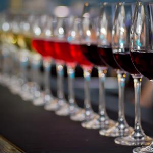
The elements of a wine bottle work together to make a complete impression on shoppers. The shape and color of glass used in the bottle are relevant, and the shade of the wine adds to the visual impact. Then, there’s the label. You have a lot of control over the texture, content and color of wine labels, and you shouldn’t take these design decisions for granted.
Napa Valley Register columnist Dan Berger recently explained theories behind label color choice have changed over the years. Common wisdom from an earlier era recommended brands build excitement by going for red, yellow, light green and other bright hues. These exciting shades are purported to drive impulse buying, as people make up their minds to buy the most instantly appealing bottle.
Berger added that recent years have seen some vineyards react against this ingrained wisdom by developing bold, black-and-white palettes. Some vineyards have gone further, adding design elements that invoke cannabis; this approach may be one answer to the question of how to sell wine’s coolness in markets that offer legal recreational marijuana.
A bright example
Creating a complete package is the crux of wine label design. When every part of visual presentation gives an accurate picture of what the wine tastes like, customers may be especially satisfied with the choice they’ve made. Exciting colors and design elements draw people in, and then keep them coming back.
VinePair’s recent ranking of popular pinot grigio brands contained an entry that exemplifies unified visual style: KRIS Pinot Grigio sports bright labels with green, red and yellow elements on a white field. The screw-off cap makes the wine seem unpretentious, and the wine’s tasting notes describe “colorful aromas and flavors” hinted at by the label.
Print in your own vineyard
When label printing goes in-house, you gain control over the process, allowing your brand to produce the amount and type of labels that suit your products perfectly. Check out Optimedia Labs’ U.S. site or Canadian store to find a high-quality in-house label printer.