

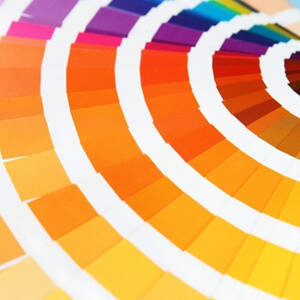
The color of a beer tells you a lot about it, but cans make it more difficult to see than do bottles. One company has found a solution that not only conveys this information but does so in a stylish way. It does so by referencing the well-known Pantone color system.
AdWeek recently reported on the design, which comes courtesy of the agency Txaber. The cans resemble the popular Pantone cards used to illustrate different shades for design purposes, and while they all stay within a clear spectrum, they also represent a surprising variety of hues, from orange to yellow to almost black. Each beer also comes with a number,
Though the color takes up most of the space on each can, there’s also a caption with the beer’s name, rendered in a font that is distinctive but still easy-to-read. AdWeek’s David Gianatasio writes about the impressions the labels give.
“I like Txaber’s restrained, elegant approach,” he says. “You get lots of color and, in tiny typeface (HipstelveticaFontFamily, which is free to download), the beer names and Pantone designations. That’s all you need. The results are especially compelling when the cans and bottles are grouped together.”
In addition to standard cans, the designs are also used in bottle-like containers made of the same material. This extension of the design expands it up into the neck and features a bottlecap in a matching color.
Of course, because Pantone is a particular company, there’s the question of whether the design might confuse consumers. But overall this is a creative use of space that shows the kinds of leaps color label printers allow brewers to make. Well-designed beverage labels stand out more when printed with a high-quality industrial system.